telling-stories-with-data-portfolio
| home page | visualizing debt | critique by design | final project I | final project II | final project III |
Assignment 3 & 4: Critique by Design with Tableau (MakeoverMonday)
Step one: choose a data visualization from MakeoverMonday
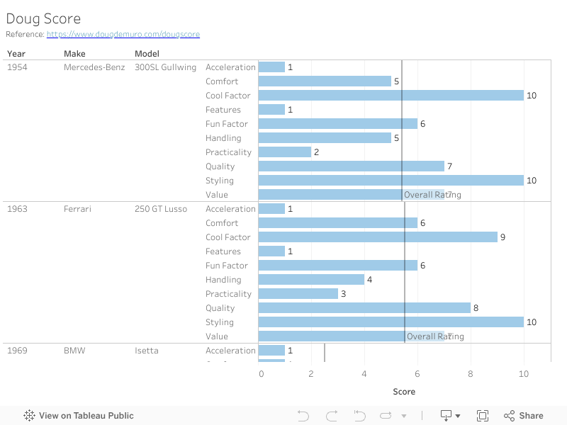
The data I choose is Dough Score. As a big fan of cars, I have been watching car reviews created by Youtuber Doug since 2018. He reviews cars and gives scores for each, which helps buyers making desicions for their next ideal match. Although he reviews daily cars such as a Toyota 4Runner, he is more biased towards exotic cars. In his own words:
“One thing to note: since I primarily review performance cars and special cars — and since my personal opinion is that performance cars and special cars are the best cars — the DougScore is designed to be geared towards exciting cars.”
Source: https://www.dougdemuro.com/dougscore
Step two: critique the data visualization
In this section, I will critique the Dough Score using techniques introduced by Stephen Few.
Informative (produces understanding)
- Usefulness(8pts)
Dough Score is useful and informative as it provides a systematic review of over 500 cars. It evaluates cars in two big aspects: daily (commute) and weekend (show-off) with 5 aspects of each. Each aspect ranges from 1 to 10, resulting a total score of 100, a commonly used scale by most people. Also, it includes a link of the related video, making it accessible for readers who wants more information. However, it contains too many cars that most people do not need to access all of them. - Completeness(3pts)
This is a huge weakness of Dough Score. It only gives an abstract name for each aspect it reviews. Readers can only get a rough sense of what the score is talking about without understanding some details. In fact, some aspects are subjective, e.g. styling, while some are very objective, e.g. acceleration. Dough actually spent a few hundred words to explain each aspect (SEE APPENDIX BELOW FOR MORE INFO,) but all of explanations are missing in the graph. - Perceptibility(5pts)
The good thing is this graph uses table to show data. Table is good at displaying and comparing many data records at the same time. ALso, this graph is crafted to provide a lot of information, but they are hard to understand. On one hand, numbers are vague, there is no direct reference. Seven sounds not bad, but what are other cars that also share the same score in this field? On the other hand, as mentioned in completeness, readers need additional information to understand the scoers, but the information is not included in the graph. - Truthfulness(6pts)
Dough score is subjective. As he mentioend in the description: “Enjoy the DougScore. Argue about the DougScore. Insist the DougScore is wrong. Use the DougScore as a metric to buy your cars. Use the DougScore as a metric to gauge my idiocy. Completely ignore the DougScore, if you want. Get tired of typing “DougScore.” But regardless of what you do, it’s here — and it’s going to give you a more complete picture of my thoughts about each car.” Although Dough is a professional car reviewer who has rated hundreds of cars, it does not mean everything is valid and sound. Apprefciating a car is also subjective, two persons can have completely different scores for the same car. Considering the background of Dough, the score for truthfullness is higher than average. - Intuitiveness(5pts)
This one is hard to rate because Dough Score is like a double edge sword. What is does well is that its scale is not really easy to understand for normal users. People can quickly get a rough sense of whether a car is good or bad from its overall score. There, however, is no explanation for the scores. In fact, the score represents an absolute score, if a car has a higher score, it means it is more suitable to dirve overall. A user can never understand this unless they get a chance to read the explanation, which is not included in the table.
Emotive (produces a useful emotional response)
- Aesthetics(5pts)
Using a table is good enough for this table, but Doug added many unnecessary things to the table.
First, colors. Colors are used wrongly in this graph. Cars are assigned to a color randomly. An Audi can have both black and red colors.
Also, red and green should be resoncidered. Not only color blinded people cannot tell the difference, but also red gives a negative feeling that these scores may be minus. In fact, columns respresented by red are extremely important: they shows how fasinating a car is.
Second, font directions. It is very confusing for readers when fonts are aligned in three directions. The vertical one is even unreadable. - Engagement(9pts) This is where the Dough Score does extremely well. Thanks that Dough is a professional car reviewer, his score focuses on the right aspects for a car enthusiast to get involved. Take an example of myself, his score covers all aspected I am interseted, e.g. accelaration, styling, comfortness, and value. I also highly appreciate he includes all car review links in the table. These video
Overall Observation
The Doug score is well designed that analyzes cars in ten different important perspectives and gives a useful reference for car lovers. It also uses the proper data type, a simple table, to compare and contrast different cars. However, the misuse of color is a big miss. All these colors caught my eyes instantly, and I started wondering what the meaning of the colors are. Removing them can be a simple but effective choice.
Primary Audience
The primary audiences are car lovers, or at least someone with some basic knowledge of cars. Essentially, the table is comparing cars from different brands, models, or same model in different years. For an audience to have a minimum understanding, he/she needs to know what the car is and what does it look like. For its ideal target, this graph does a good job.
Final Thoughts On Methodology
I like this way of evaluating a visualization. It forces me to think from all aspects of a graph, including its context awareness and design implementation. One thing to improve is the junction of perceptibility and completeness. Since both are talking about whether the visualization is easy to understand, I got confused about which section I should address more. Anther recommendation is to add styling in aesthetics section. Based on whether a graph is conceptual or statistic, the way of repesentation could be totally different.
Step three: sketch out a solution
I made two refine visualizations based on my critique and feedback from others.
Graph 1: Simple Table
This solution tries to refine the table in the following ways:
- Remove unnecessary colors to avoid confusion.
- Rename columns for easier undersatnding. For example, weekend -> showoff/performance, daily -> commute.
- Add a floating card to explain key metrics, especially those are objecitve.
- Replace “welcome to Doug Score” to meaningful columns: year, make, model.
Graph 2: Radar/Circular Area
The second graph aims to amplify the visual effects by introducing a radar graph. With each column represented by an axis, it is easy to visualize and compare how a car perform among others. I also delete other information such as film location and URL. Initially, everything is in grey, and it will be assigned a color when user selects it.
Step four: Test the solution
I made the first solution and gather feedback from my girlfriend, then I quickly realized there are still many things need to be improved. After that, I made my second visualization and gather feedback from my roommate and classmates.
My Question List
- What do you think this visualization is talking about?
- Do you feel this visualization is self-explained?
- Do you feel necessary to add colors to this visualization?
- Do you think this graph needs to be interactive?
Feedbacks
- girlfriend, 25+, car industry
Likes:
remove the colors
rename and align column names
Dislikes:
floating card is still distracting, display the explanation when mouse hovers on it if applicable
context may be unclear; for those who do not know cars, they cannot tell what is Lucid(a brand) -
roommate, CMU Student, 20s, not interested in cars
Likes:
area size directly shows how a car performs
Dislikes:
hard to compare which area of a car is larger
too many grey lines make the whole graph hard to read
no idea about what a car looks like
missing a title - other classmates, group discussion
They confirmed the idae of highlight a car when it is selected (making it interactive.)
Step five: Build your solution
I asked the following question before I build my final visualization.
Question 1: conceptual or statistical? -> statistical.
Question 2: exploratory or decalarative? -> exploratory(confirmatory to exploratory)
First, I renamed columns and adjusted data types for year, based on my thuoghts on refineing the table.
Difficulties: It’s complcated to make a radar graph in Tableau.
There is no ready-to-use solution to build a radar graph in Tableau.
I researched online, it needs me to modify the data and compute corresponding values on each axis based on trigonometry functions.
Reference: https://www.tableau.com/blog/use-radar-charts-compare-dimensions-over-several-metrics-41592
Considering that I have spent over 10 hours on this assignment. I decided to go back and make everything easier.
I removed classification between performance and communte, then added a average line for each car, which can be used as an equivalent of total score.
Here is the final result:
Appendix: Dough Score Explanation
So how does the DougScore work? There are 10 separate categories, and they’re each judged on a scale of 1 through 10 — with “1” being the worst, and “10” being the best, meaning the highest possible DougScore is 100. The ten categories are split into two separate groups: “Weekend” and “Daily.” The “Weekend” categories measure a car’s appeal to enthusiasts; in other words, how much fun it would be to drive on the weekend. The “Daily” categories, meanwhile, focus on a car’s livability and practicality.
Each car is judged against all other cars and not only its segment. That’s an important point because it means these categories aren’t relative, but rather absolute: the car with the very highest DougScore is the best overall car I’ve ever driven, and the car with the lowest is the worst. The car with the highest “Weekend” score is the best enthusiast car I’ve driven; the car with the highest “Daily” score is the most practical and livable car I’ve driven.
And yes, this means I’ll be comparing a Hummer H2 to a Ferrari 488; a Trabant to a Lamborghini Huracan. The H2 will probably beat the others for practicality. The 488 and Huracan will win for everything else. The Trabant will simply lose.
One thing to note: since I primarily review performance cars and special cars — and since my personal opinion is that performance cars and special cars are the best cars — the DougScore is designed to be geared towards exciting cars. For instance: if a car does 0-to-60 in over 7 seconds, it gets a “1” for acceleration. That’s a reasonable time for a minivan, but I’m judging enthusiast cars — so most “normal” cars would likely end up with a low score in acceleration, and most of the other “Weekend” categories.
One other note on the DougScore: I may make slight alterations, here and there, after I’ve published a car review. For instance: a car may debut with an impressive level of features and equipment, only to soon be outclassed as the car industry moves along and adds even more cool items — which could result in a lower score for that car. I also suspect I’ll give “DougScore” awards at the end of the year, and then wipe the slate clean with ever-changing definitions each year, as cars continue to get faster and more advanced.
Enjoy the DougScore. Argue about the DougScore. Insist the DougScore is wrong. Use the DougScore as a metric to buy your cars. Use the DougScore as a metric to gauge my idiocy. Completely ignore the DougScore, if you want. Get tired of typing “DougScore.” But regardless of what you do, it’s here — and it’s going to give you a more complete picture of my thoughts about each car.
With that in mind, off to the categories:
Weekend There are five “Weekend” categories, and five “Daily” categories. The weekend categories focus on the car’s appeal to enthusiasts; in other words — How much would you want to drive the car for fun, on the weekend? The categories are:
Styling
This one’s easy: How does the car look? If it’s tremendously ugly, like a Ssangyong Rodius, it gets a “1.” If it’s just very ugly, like a Pontiac Aztek, it gets a 2. Somewhat ugly cars (cough, Honda Civic Type R, cough) get a 3, while slightly less-than-attractive cars earn a 4. An average car earns a 5, while slightly nice looking cars — the BMW 340i, for instance — earns a 6. Numbers 7 through 10 are reserved for the very most beautiful cars, with “10” taken only by the best — the Jaguar E-Types and Mercedes 300SL Gullwings of the world.
Yes, styling is subjective — in fact, it’s probably the most subjective item on this list. If you disagree with my assessment, create your own rating system. If your name is Keith, you can call it the KeithScore. I won’t sue.
Acceleration
Acceleration will be scored objectively, using published 0-to-60 times, in the following way:
Under 3 seconds: 10 points
3.0 to 3.5 seconds: 9 points
3.6 to 4 seconds: 8 points
4.1 to 4.5 seconds: 7 points
4.6 to 5 seconds: 6 points
5.1 to 5.5 seconds: 5 points
5.6 to 6 seconds: 4 points
6.1 to 6.5 seconds: 3 points
6.6 to 7 seconds: 2 points
7.1 seconds and up: 1 point
Handling
As you might expect, the best cars will earn a 10, while the worst car will earn a 1. A “1” in handling will be reserved for cars that actually feel dangerous to drive — the Trabants of this world. Unsecure, floaty, vague cars (the Yugo, for instance), would earn a “2,” while even a modern big SUV deserves a 3 — since at least they feel relatively secure. A fairly standard family car would earn a 5, while performance cars will duke it out for the top numbers. If I were to make assessments right now, I’d say the Lamborghini Huracan gets a “10,” the Shelby GT350R gets a “9,” the Ferrari California T earns an “8,” and the Honda Civic Type R would get a “7.”
Fun Factor
The “fun factor” category is another one that’s somewhat subject to my opinion and based on how fun the car is to drive. One way to think about it this - if someone handed me the keys to every car I’ve reviewed, the ones with the highest fun factor score would be the ones I drive first, and the ones with the lowest fun factor score would be those I’d drive last.
Cool Factor
The “cool factor” category is a combination of both how cool the car is and how important it is. You can think of it as “how much can a car turn heads?” and “how important is it to the car world - if you were creating a car museum, how likely would you be to include this car in it?” But it isn’t all about how much the car appeals to the masses — it’s also designed to reward cars that would turn enthusiast heads at cars and coffee. The cars that earn 10 points here attract both the masses and the enthusiasts (think Jaguar XJ220 or the Bugatti Veyron), while the cars with lower scores would be everyday rides like the Toyota Corolla and Honda Pilot.
Daily Just like there were five “Weekend” categories, there are five “Daily” categories — each examining how livable, practical, and financially sensible the car would be to own. Think of the daily categories as answering the question: How much would you want to drive the car every day?
Features
Features is, once again, rather subjective. You could measure it objectively, but it would be a nightmarish process that involves assigning a value to every feature and trying to figure out whether each car offers it. Instead, I’ll have a look around each car and decide just how well equipped it is. Only the cars with the most innovative features score very high in this category.
As you might expect, this category will hurt cars like the Porsche 911 GT3RS and the new Ford GT, which have stripped-down, track-focused interiors — and so it goes in the “Daily” group. Additionally, this category will hurt older cars without modern amenities, as I’m judging them by the standards of today, rather than the standard of their time. For instance, the 1990s Rolls-Royce Silver Spur I drove would likely only earn a “4” or “5” in “Features,” since its equipment isn’t impressive compared to modern vehicles.
Comfort
Comfort differentiates itself from features because this category is about the smoothness, the ride quality, and the luxury. The Ferrari 488, for instance, has a lot of cool features — so it would probably earn a “7” in that category. But it isn’t very luxurious, as it’s loud, its ride is harsh, and visibility is mediocre, so it’s probably a candidate for a “4” or a “5” when it comes to comfort. The big winners in this category will be cars like the Rolls-Royce Wraith, the Bentley Mulsanne, and the latest crop of luxury SUVs.
Quality
Quality is an important category for people who are actually interested in buying each car, and I’m going to think about quality in a few ways. The biggest is the actual quality of the items in and around the car: Does everything feel nice? Has the car cut corners in any obvious areas? Are there any rattles or shakes where there shouldn’t be?
These items will give high-end cars an advantage, but then there’s the other part of quality: reliability. A car like the McLaren 570S might have a high-quality interior, likely worthy of a “10” in this category, but will the mechanicals and electronics last? Even the mere perception of unreliability can drop a car’s score here, since we won’t know reliability figures for each vehicle — I’ll just have to guess based on what I think, what I hear, and what I’ve experienced.
Practicality
Like acceleration, practicality will mainly be based on an objective standard that primarily considers cubic feet of cargo volume. It’ll go like this:
0 to 3 cubic feet: 1
3.1 to 6.5 cubic feet: 2
6.6 to 11 cubic feet: 3
11.1 to 16 cubic feet: 4
16.1 to 24 cubic feet: 5
24.1 to 34 cubic feet: 6
34.1 to 48 cubic feet: 7
48.1 to 64 cubic feet: 8
64.1 to 72 cubic feet: 9
72.1 cubic feet and up: 10
With that said, some cars may jump ahead of their “cubic feet” class with a few tricks. For example, the Porsche 911 only has 4.7 cubic feet of cargo space, which would give it a “2” — but it has back seats and a lot of little interior storage pockets. That’s probably enough to get it up to the “3” category, even if it doesn’t have the storage volume of some of its “3” peers.
Additionally, “practicality” will be the category that considers fuel economy. While the Mercedes GL63 AMG’s massive 93.8 cubic feet of cargo space easily earn it a “10” in this category, its combined 14 miles per gallon would drop that figure right down to a “9” — especially since many other vehicles offer similar cargo space without the massive penalty in fuel economy.
Finally, this category considers how practical a car is to actually use. For example, the Rolls Royce Phantom has good cargo room, but wouldn’t be something you’d drive everywhere — it’s huge and attracts massive amounts of attention.
Value
Finally, I’m going to try to assign a number for “value” — in other words, whether the car is worth its current market value. Value might just be the most difficult number in this entire group to assess, as it factors in all of the above categories — but it’s also among the most important, as it’s the only category that really considers the car’s price. Yes, a half-million-dollar car can be a good value — if it excels at what it does, and if it won’t radically depreciate. By the same token, a $20,000 car can be a poor value if it’s unreliable, low on equipment, and deficient compared to rivals.